*This website has been laid out to match the navigation layout of the CRM portal*
The Dashboard is the starting point each time you login to your account.
Dashboard – New Account
This is what a brand new account looks like with no information added yet.
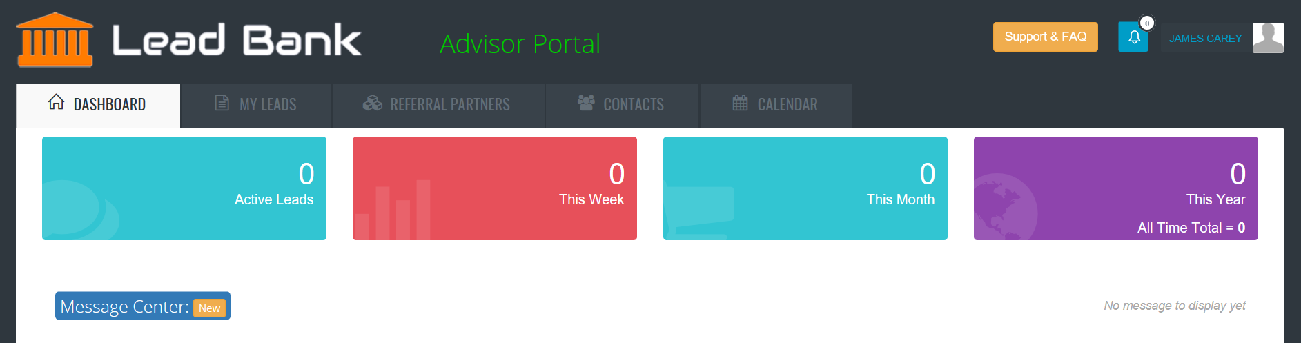
*This what your dashboard looks like for a brand new account – there hasn’t been any information added yet.
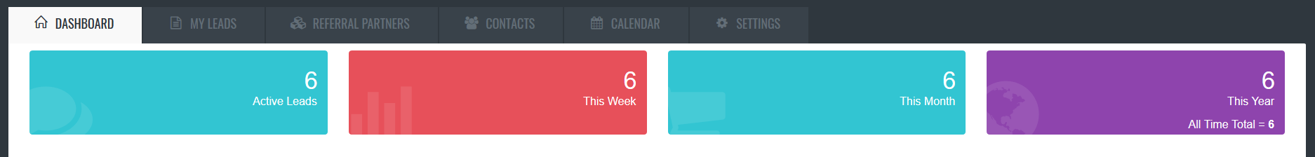
Dashboard – after adding some content
The Dashboard will start to take shape as you add referral partners and leads.

Notice this view has a bar graph and pie chart? That’s because new leads and referral partners have been added.
How to add a referral partner?
How to add a new contact?
Lead Counters
Easily see how many leads this week, month, year and all time.
Lead Activity Indicator – Days Since Last Upate
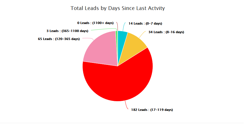 This pie chart shows a quick view of how active you’ve been in working your leads.
*The colour tags match the left hand column in the LEADS view. When an agent updates a lead with new information, the counter is set back to 0 days since last activity and the coulour will be blue.
Activity Signals are based on the following:
- 0 – 7 Days Old (Blue)
- 8 – 16 Days Old (Yellow)
- 17 – 119 Days Old (Red)
- 120 – 365 Days Old (Pink)
- 365 – 1100 Days Old (Lime Green)
Top 5 Referral Partners by Count
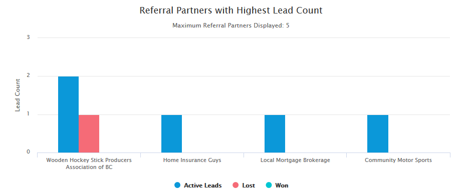 This bar graph showing your top 5 referral sources becomes active as soon as your first referral partner ads the first lead for you. Once you have multiple referral partners the graph will show you the top partners by total count (total leads submitted).
In the live view – you can rollover the bars to see the actual number of active won and lost leads by referral partner.
This view is ‘all-time’ and cannot be modified by date… yet.
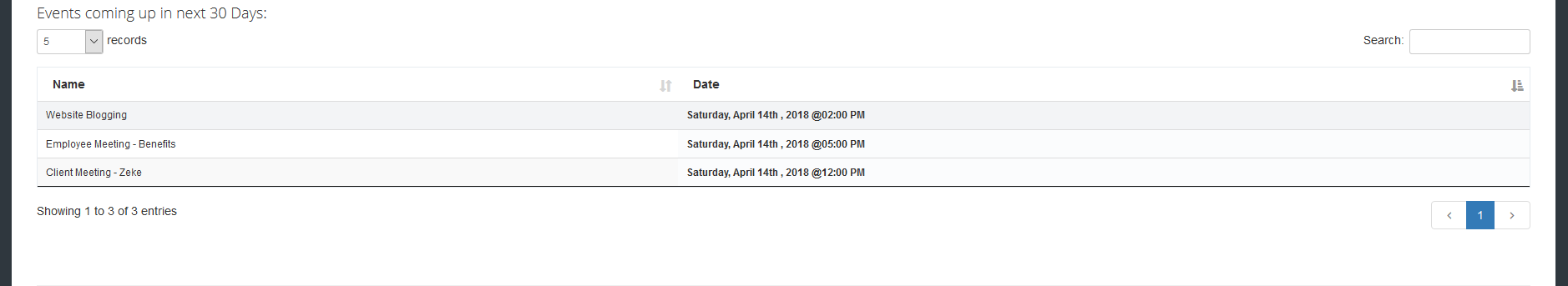
Calendar – Dashboard Summary
The calendar will evolve as the platform develops – in the current version, you will see a list of your upcoming events in the Dashboard view.
*Note: referral partners cannot see an agents calendar or dashboard – only the contact info and non-private notes for the leads they’ve sent.